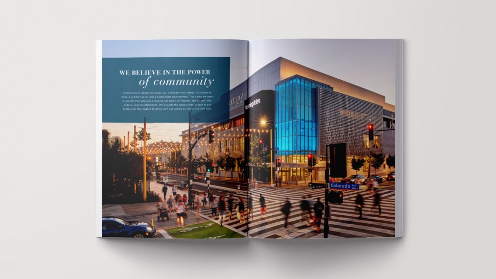
PROJECT INTENT
Prior to my start at Macerich there had been a soft brand reset, in which the long-standing primary brand color of blue had been switched for teal. Problem was, the brand change was a small rollout and only those that created it had implemented it. This change, among other smaller tweaks that were also ignored, had lead to a very fractured branding as there were still numerous key elements with older branding and several that had seen many iterations of updates in recent months.
I was tasked to examine all these elements and provide a recommendation for a natural evolution in the brand. Below is a small collection of the brand as it existed.
PROCESS
I had started the project by examining some of the creative of major competitors and those in the area. Also examined several museums creative campaigns among other trending design for other inspirational design direction. Next, I began talking to others in the company as what the brand meant to them: examining the core driving initiatives, thoughts on the mark, messaging, and goals.
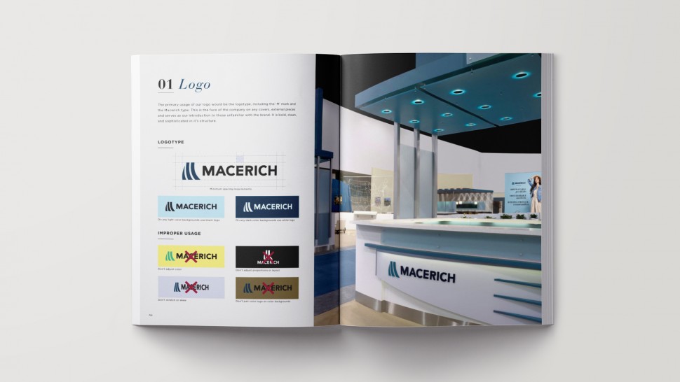
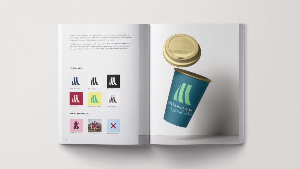
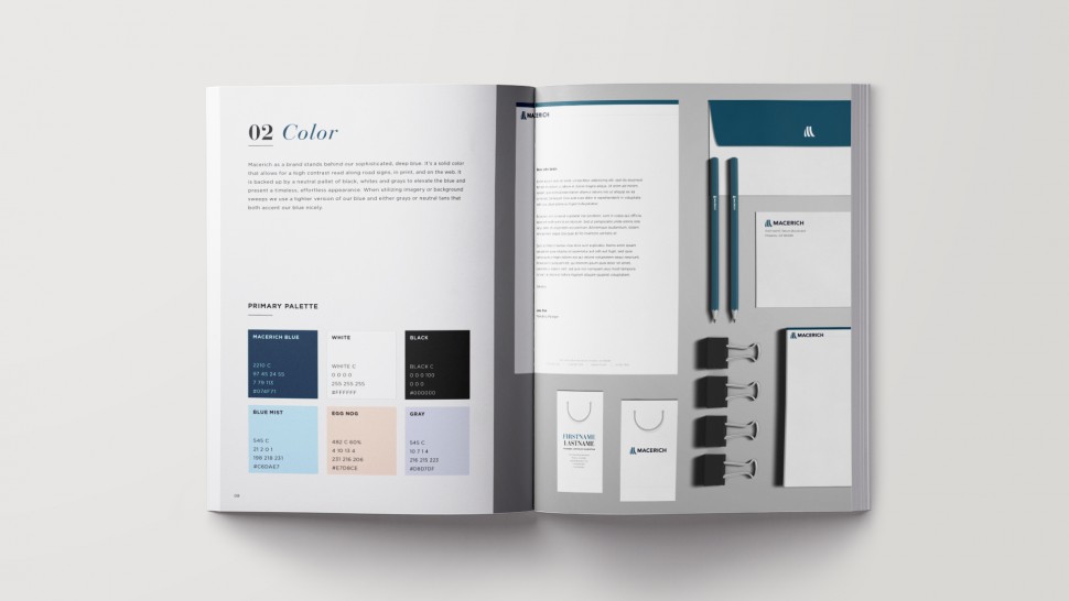
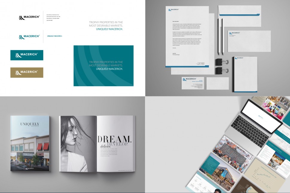
With a full conference room of notes and pictures, I began to modify the mark slightly. I didn’t want to change it too much, in fact, I debated any change at all because of how many spots the logo ends up. Ultimately, I kept finding that the current logo is unbalanced when attempting to use in various applications, especially when that logo appears in conjunction with another brand’s logo. I felt it was best to balance the logo more properly, use color more in line with the blue most of the company had been using, but make the whole thing tighter and slightly more sophisticated, but still recognizable for those familiar with the brand.
I knew what many of the malls had been using in their centers and it was easy from there to tweak and bring more uniformity to everything once the mark and color pallet had been cleaned up.
RESULT
While the marketing team was open to logo tweaking and many of the proposed updates, the timing could not have been worse. At the time these were presented the CEO decided to retire and left much of the future vision of the company open to debate. The project was shelved for a time in which a new CEO would be brought on and pitched their vision of the company, which may or may not end up impacting the direction we go with branding.
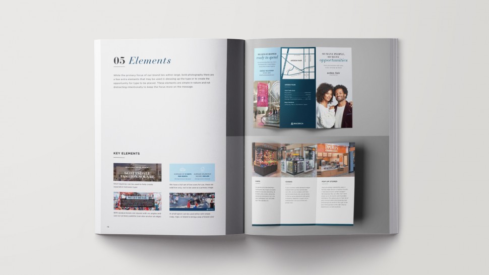
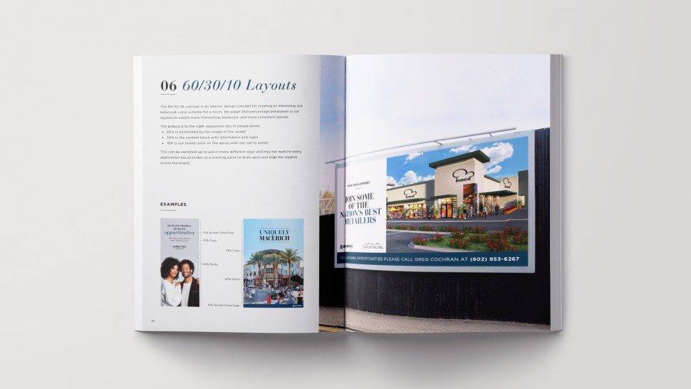
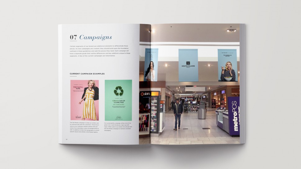
Below are the recommendations and examples I had presented to the team: